


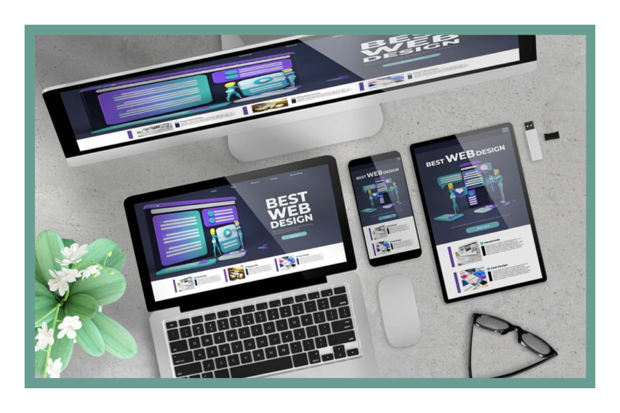
When two websites serve the same purpose, do you ever find yourself wondering why one is preferred over the other? When it comes to persuading visitors to stay on a website and remembering it after they leave, web design plays a crucial role. However, designing a website has never followed the conventional theoretical procedure described in textbooks, and it never will. Website designs are always changing and affected by many factors, just like any other aspect of technology.
In this post, I’ll go through some of the latest trends in web design that have grown popular with users or provide a better overall experience. A better-designed website will prove to be incredibly efficient for the business and sustain a loyal user base because we are now using a browser more than ever as we become more restricted to our houses. Let’s get started.
1-Minimalist design layout

If you’re building a website from scratch today, the first rule to follow is to keep the design simple and include only the most crucial information on the homepage. Landing pages should be kept to a bare minimum in design, with the majority of the site’s features housed on subpages or behind clear navigation menus.
The primary reasoning behind the practice is that websites with fewer components tend to have a cleaner, more organized appearance. Having fewer alternatives on the page can entice the user to take the desired action while reducing the likelihood of them being distracted. Therefore, if you use minimal designs, the user is more likely to read everything you want him to read, so long as the color and size are suitable.
2-Responsive Web Design

A website’s responsiveness is a crucial feature that must not be skimped on. Since 2017, mobile devices have continuously contributed more than half of all internet traffic. Mobile devices accounted for 50.8% of all global internet traffic in the third quarter of 2020.

Percentage of mobile device website traffic worldwide from 1st quarter 2015 to 4th quarter 2022
In addition, we saw how impatient a user may be when it comes to exploring the web. This proves clearly that more than half of your website’s traffic and users are at risk if responsive design is ignored.
Google’s mobile-first policy has made the responsive design even more crucial, as it now penalizes non-mobile-friendly websites. So, first, figure out who you’re targeting, then settle on a domain name, and finally, launch with a responsive design.
3-Mobile Friendly Website
The difference between a mobile-friendly and a responsive website is often misunderstood. However, the truth is that they are different.
| Mobile Friendly website | Responsive website |
| A responsive website adjusts its behavior based on the visitor’s device, browser, screen size, and other factors. To accommodate a smaller screen, you may, for instance, adjust the ratio of the elements to fit, use the “picture element” to choose an acceptable image, or simply add some media queries and let them do their thing. | Responsive web design shrinks buttons to fit the screen, and mobile-friendly layouts take into account the need for adequate space around them to prevent unintentional taps. |
| Search results in a responsive design are shrunk to fit a mobile screen. | In a mobile-friendly design, the column method may be modified to produce multiple columns of results. |
4-Vertical navigation Menu
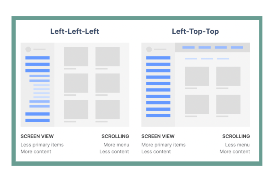
When designing a website, it’s crucial to put extra effort into the navigation menus. Your website’s navigation menus are the only point of access to the site’s additional content. However, keeping navigation menus updated is a complex task. Menus for navigating should work in both landscape and portrait modes. The usage of a vertical menu to navigate between pages is one such design paradigm.
Because it becomes more difficult to see and click on a smaller screen with one’s hands, responsiveness is also taken into account when designing menus.
5-Consistent Typography
A safe, clear, and bold font — a cornerstone of minimalist design — must appear prominently on the page.
The following are essential components of readable typography:
- large text, typically greater than 16px
- text on a black or gray background
- System typefaces for the web
- line spacing that is just right for effortless reading.
Most businesses choose to identify themselves in part through the fonts they use. The New Yorker, for instance, creates its instantly identifiable typeset in Adobe Caslon. It’s a good idea to choose a typeface for your website that can be used consistently throughout the many pages and other materials you offer.
6-Design optimized for speed

One of the most common blunders in web design is a layout that takes too long to load. This is bad for search engine optimization and conversion rate optimization. A 7% drop in conversion rate has been found to occur for every second that a page takes to load. These numbers demonstrate how urgent it is for websites to load quickly on all platforms, not just mobile ones.
These days, users want a website to load almost instantly, or they will simply move on to another one. Fortunately, optimizing the fundamentals of web design for speed is a simple process. Just a few simple actions are:
- No matter the size, optimize every image.
- Select a reliable web hosting service, such as a virtual private server, a shared server, or a dedicated server.
- To keep file sizes down, use compression.
- Decrease the number of HTTP queries made in Chrome’s developer tools.
- BrowserStack SpeedLab provides comprehensive reports on the site’s speed in relation to many parameters.
7-Hamburger Menu
The vast majority of websites provide visitors with an endless number of customization choices. While this may simplify the user experience (by allowing them to quickly access the option of their choice from the homepage), it also consumes a lot of space, especially on mobile devices.
Use a hamburger menu, a button that expands into a larger menu or navigation drawer, to fix this fast. This reduces clutter and saves room without impairing the user experience of navigating the site.
8-White Space

White space, an integral component of minimalist design, is crucial for the free-flowing layout of any modern web page. Every internet user is bombarded by an unlimited stream of data, which can lead to mental fatigue very rapidly. The site’s cleanliness, organization, readability, and user-friendliness are all enhanced by the appropriate use of white space and content.
Apple, in its pre-launch days, is a good example of how white space can be used effectively. It’s no surprise their name has become linked with one of the industry’s most innovative design pioneers.
9-Semi-Flat Design

When there are no complex or overly technical elements on a website, a flat design is easier for users to understand, and the page can load faster. Many businesses have adopted flat design because it improves readability.
Whether you choose a flat design, employ shadows, or do something entirely different, it needs to be subtle and consistent throughout the site. Please ensure that all of the website’s pages and sections employ the same design cues to aid site users in making sense of the content they’re reading.
10-Hero Image Usage

Another common practice in web design is to use a full-screen image as the basis for the homepage. Banner images with the largest dimensions, known as “hero images,” are ideal for placement above the fold to pique the attention of potential customers.
Hero photos should be kept basic so that users can see the content above them. If the text is going to be in the same area as the menu bar, it needs to be bolder and stand out more. It guarantees clear sightlines.
Suggested Read: Top 10 trending software development trends in 2023
Last Words
We’ve gone over some of the basics of web design so that you may create a stunning site and add your own unique style to make it stand out from the crowd.
There are many more design components to consider when creating a website, but the ones we covered above will get you off to a good start. However, if you want more guidelines and For suggestions on your website design, top web design and development company Oplox Tech offers free consultations. Contact here.


Leave a Comment