


We all know that sickening sensation when we see poor UX design mistakes like high bounce rates, low conversions, and complaints.
A few slip-ups in user experience (UX) design are natural, but they should be kept to a minimum. To avoid falling behind and ensure consumer pleasure, take a proactive approach.
We’ve listed the 05 most typical UX design mistakes and how to avoid them to help you get there. Learn what these blunders are and why great UX design is important for the future of your online business.
Importance of good UX design
Good UX design is the most efficient approach to making a product or website that appeals to customers, keeps them coming back, and makes them happy.
Customers are more likely to achieve their goals, maintain usage, and spread the word about your business if they have a pleasant, stress-free time using your product.
On the other hand, if people have a bad experience with your product, they may quit subscribing to it, stop using it, and even tell others about their bad experiences.
To sum up the fundamentals of great UX design:
- Promotes confidence and reliability
- Affordable and time-saving.
- Brings in fresh customers
- Promotes Usage
- Increases Recurring Customers and Loyalty
- decreases customer turnover
- helps search engine ranks
Suggested Read: 10 most important elements of modern web design in 2023
10 common UX design mistakes you should avoid
It might be difficult to give the greatest possible product without continuously optimizing the user experience (UX) you provide in response to changing client pain points and wants.
Why not tackle UX with a proactive mindset rather than waiting for roadblocks? We’ve compiled a list of the top 05 UX design mistakes so you may learn from our mistakes and avoid making the same ones yourself.
1-Wrong balance of aesthetics and functionality
You can’t only focus on the product’s aesthetics or functionality and expect to provide a fantastic user experience.
Too much emphasis on either visual appeal or functionality could lead to unhappy consumers and negative word-of-mouth for your business.
In most cases, the functionality should be given a little edge over aesthetics. Even if a product looks fantastic, its UX will suffer if it doesn’t perform as promised.
Let’s look at an example. For example, the homepage of budget airline EasyJet’s website has an attractive appearance but poor usability.
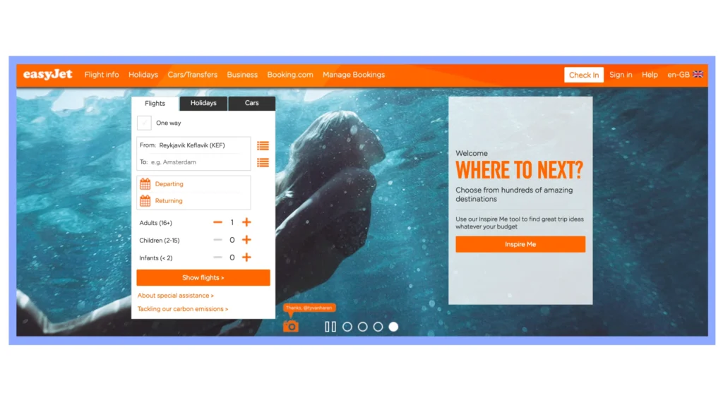
The main reason people go to EasyJet is to book a flight. The flight booking form and the ‘Inspire Me’ elements on Easyjet’s homepage take up about the same amount of space, leaving consumers confused as to what they’re supposed to do. Too much is happening on this page, from the crowded menu bar at the top to the numerous pop-ups and moving images.
Travelers may become sidetracked or confused before they manage to reserve a flight. The user interface (UI) is visually appealing, but it is impractical and causes the customer journey to be muddled.
Suggested Read: How to create responsive web design in 2023
2-Ignoring users’ feedback and constructive criticism
Customers are the ultimate designers of their own experiences. By valuing their feedback, we empower them and create designs that truly resonate
The needs of your users should drive all of your decisions. Don’t make the mistake of assuming that you, yourself, are more knowledgeable than your user.
If you want to finally comprehend what your users want, you need to listen to them.
Focus on the needs of your target audience throughout the development of your product. Consider how your product might be improved so that it quickly and easily addresses user issues.
Maintain a steady loop of listening to people and iteratively improving your product by conducting UX surveys at regular intervals during the lifecycle of your product.
3-Pop-ups that overwhelm users
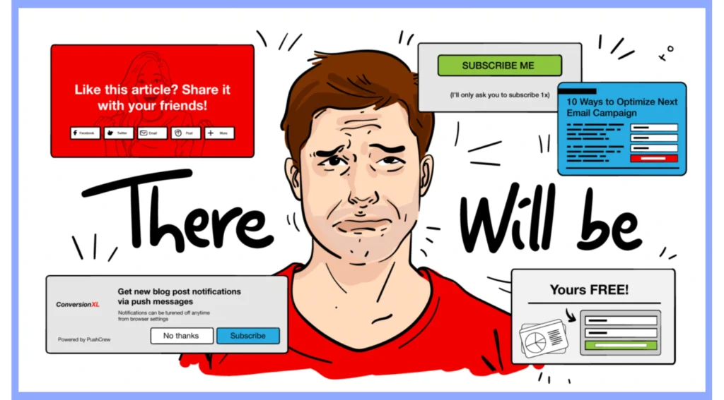
When visitors land on your homepage, the last thing they want to see is a flood of advertisements. Before even beginning their product or web journey, users are bombarded with a barrage of pop-ups that must be closed or navigated away from before they can get to the information they need.
Keep an eye out for pop-ups that are improperly positioned or constructed, or that prevent you from closing them quickly.
Pop-ups can have a negative impact on the user experience if not planned properly. Keep it to one per page and make sure it doesn’t interfere with the user experience by taking up the whole thing. Your pop-ups should be conveniently located, easy to close, and simple to respond to.
4-Ignoring the ‘in-between’ spaces
Like in real life, things rarely go according to plan in the design world. Good user experience design takes into account both ideal and worst-case scenarios.
Think about the user from beginning to end as you build your product. This should include the very first and very last steps.
Let’s pretend a user is interested in trying out your service for free. Your user will primarily go through the initial sign-up page and the success page if everything works as planned.
But difficulties arise, and you’ll frequently have to think about the “in-between” spaces (white spaces) like:
- When filling out a form, what do consumers see?
- If a user starts the submission process but forgets a required field, what will they see?
- When consumers enter their information after their free trial has ended, what do they see?
- When a problem occurs with the system or the connection, what do users see?
The needs of the user as a whole must always come first. Be as thoughtful about designing for edge cases as you are about designing for major states and ideal conditions, and provide plenty of backup and error handling to ensure you’re still providing a fantastic user experience even if things go wrong.
5-Jumping on every new UX design quickly
The design industry is filled with UX trends that come and go like fashion, music, and haircuts. While it is beneficial to be aware of current trends, you shouldn’t feel obligated to adopt every fad that comes your way.

In the early 2010s, for example, flat button design became a prominent UX trend. An outgrowth of minimalism, “flat design” rejects any depth or viewpoint in favor of a 2D plane. Due to user experience problems such as user confusion about which elements are clickable, it has fallen out of favor.
- Think about how a design trend will affect your users at all times.
- Will this make your product simpler to use and less cumbersome for end users?
- Do first-time users have a more positive reaction to the way it looks?
- Does it improve the readability of your UX writing?
Asking yourself these kinds of questions can help you stay focused on whether or not a particular design trend will actually enhance the product experience for your target audience.
Boost your UX by minimizing common UX design mistakes
Mistakes in user experience design are unavoidable, but that doesn’t mean you have to settle for them. It’s better to plan ahead and prevent UX mistakes from occurring before they annoy users.
The first step is to educate yourself on the issues and potential solutions related to user experience. Think about if you might have committed the most common errors, and if so, correct them.
Always keep in mind that a product’s UX is its backbone. Make fixing UX issues a top priority, and your business and customers will benefit.


Leave a Comment