Have you noticed how a great deal of modern life takes place online? We all spend way too much time staring at our phones, from socializing to grocery shopping. And that means exactly what? User interface design is crucial, really. Keeping users happy is the key to maintaining a steady stream of traffic.
White space is something that has been around for some time in user interface design. It’s not a hangout for blank crayons; “white space” refers to the area around and between features in a design. Believe it or not, this area can have a major impact on the design’s overall efficacy and effectiveness. Let’s dive into the importance of white space in user interface design.
What is white space?

White space refers to the unfilled areas in a design, such as those around text, images, and buttons. You can think of it as a relief for your eyes, an oasis of peace in the midst of the storm, the yin to the yang. Your design would look like a cluttered hot mess without some white space, and nobody has time for that.
Imagine being at a party where everyone is talking loudly, there are balloons and streamers all around, and the sound level is too high for you to hear anything. But you’d feel a lot more at ease if there was room to roam about, quiet places to have a chat, and some tasteful touches of decor. Interface design is no different.
Suggested: How to create a responsive design for e-commerce platform?
What’s the Deal with All That White Space in UI Layouts?
Because white space is such an important part of user interface design, using it well may completely transform the look of your site while also providing a number of advantages. Designers are responsible for producing designs that are easy on the eyes and keep readers interested. The clean, modern look is just one of the benefits; others come from real changes to the performance of the website.
The design of a product is the single most telling indicator of whether or not it is of high quality. As a designer, it is your responsibility to make a product that will appeal to a wide range of people, not just your paying customers.
Empty space on a page improves the user interface and the overall user experience. Why is white space so important in user interface and user experience design? Let’s have a look at some examples.
1-Better Readability and Legibility

The use of whitespace between lines and in paragraph margins has been shown to improve comprehension by as much as 20%.
Adding some white space between lines and paragraphs might help the text stand out more clearly and be read more easily. It might be challenging to read and understand text when there is not enough space between individual components.
On the other hand, an overwhelming amount of text might be intimidating to a reader and make it tough to locate certain details. Users will have a better time and find the text easier to digest if you employ white space to establish visual separation between elements.
2-Enhanced Focus and Attention
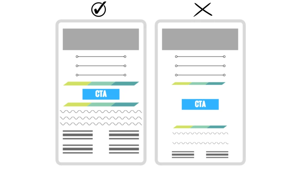
Designers can emphasize various components of a page, such as CTA buttons, photos, and headlines, by strategically placing white space on the page. Using white space effectively can help draw attention to these aspects and provide a clear visual hierarchy.
Too many choices or interruptions can leave the user feeling confused about what to do next. Strategically utilizing white space to highlight important elements can improve the user experience and engagement.

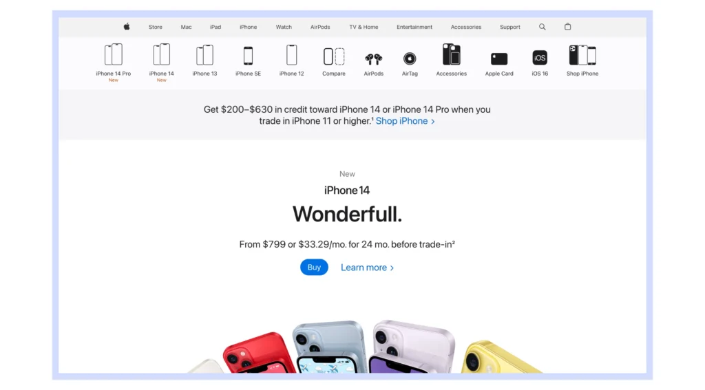
Apple is well-known for its elegant and uncluttered user interface design, which makes extensive use of white space. Apple is able to achieve this sense of balance and harmony by strategically placing white space to highlight the design’s focal points. This strategy has made Apple’s products popular among design-conscious buyers.
3-Improved Aesthetics and Branding
By fostering a sense of equilibrium and harmony among a design’s elements, white space is a powerful tool for improving aesthetic appeal. A poorly thought-out layout might confuse customers and make it tough to remember the brand. A unified brand identity is the result of a well-designed user interface that makes effective use of white space in all of its forms.

The white space and minimal aesthetic that Thinking Box displays serve to strengthen the site’s branding.
4-Gestalt’s Proximity Principle

According to the Gestalt Principle of Proximity, people tend to assume that things that are relatively close together also have similar properties. In order to put this theory into practice correctly, you must keep all of your group-related parts in close proximity to one another.
For example, you may need to collect sensitive information such as name and address in a batch, separated by some extra white space, and then another batch of fields under the credit card information.
5-Entails Luxury and Sophistication
When employed to create a certain look or feel, white space can become the focal point of a design. We associate lots of white space with class and elegance, therefore smart use of it could be how you bring those qualities into your design.
The abundance of graphical elements devalues the overall presentation. Instead, you should try to improve the design by using more pictures. Put white space to work so you can focus on making your graphics seem better.
6-Activates the Creative Process

When there is enough white space in a user interface design, users’ minds are free to wander, which elicits a deeper emotional response. There is a fundamental need for evaluation in the human brain, which creates a narrative between what you see and how you understand it.
What our thoughts draw in the blanks is unimportant, but the thinking behind it is crucial. If you take part, you’ll be putting your own money into the project’s design. Personal investment in a design increases the likelihood of making a favorable first impression.
7-Improved User Experience
The use of white space in user interface design serves to enhance the overall quality of the interface for the user. Designers may lessen user frustration and boost engagement by making the interface straightforward and simple to use. Having enough white space on a page can make it simpler to read and navigate since it draws the eye in and creates a sense of tranquility and clarity.
Final Words
In web design, white space is essential. Inadequate content is just as important as having material on your site. White space is more than just blank space; it’s a powerful design element.
Think of white space as more than just empty space; it’s a design feature that makes everything else on the page possible. This area provides a sense of harmony and reminds us that aesthetics matter in design. To communicate a straightforward idea, you need not resort to a layout heavy on visuals and words.


Leave a Comment