


Interactive UX button design practices – All you need to know
Lots and lots of buttons. Everywhere we go, we come across these little digital heroes, just waiting for us to click on them so we can use their special abilities. But here’s the trouble: not every button is the same. Keeping up with the latest UX button design practices in the ever-changing field of user experience (UX) design is the secret handshake to a smooth and enjoyable user journey.
Looking to make your buttons more user-friendly? Check out this guide to learn about the many types of UX buttons and best practices for designing buttons. This will ensure that your website’s user experience remains uninterrupted and stress-free at all times.
Suggested Read: 10 important elements of modern web design in 2023
What is the UX button?
Users can take action or move around in a digital product with the help of a UX button, also known as a user experience button. It’s a spot that, when clicked or tapped, executes a predetermined sequence of events. To improve the usability and user engagement of a digital product, it’s important to have user experience buttons of varying sizes, shapes, and designs.
In order to design buttons that provide a positive user experience, designers must think about things like label clarity, visual appeal, responsiveness, and feedback.
Standard UX Button Designs practices
Buttons allow users to quickly and easily make choices and conduct actions. In response to button prompts, users can perform the indicated actions. Buttons are a common part of a website’s user interface (UI); therefore, it’s important that they stand out from the background and are easy to discover.
1-Standard Buttons
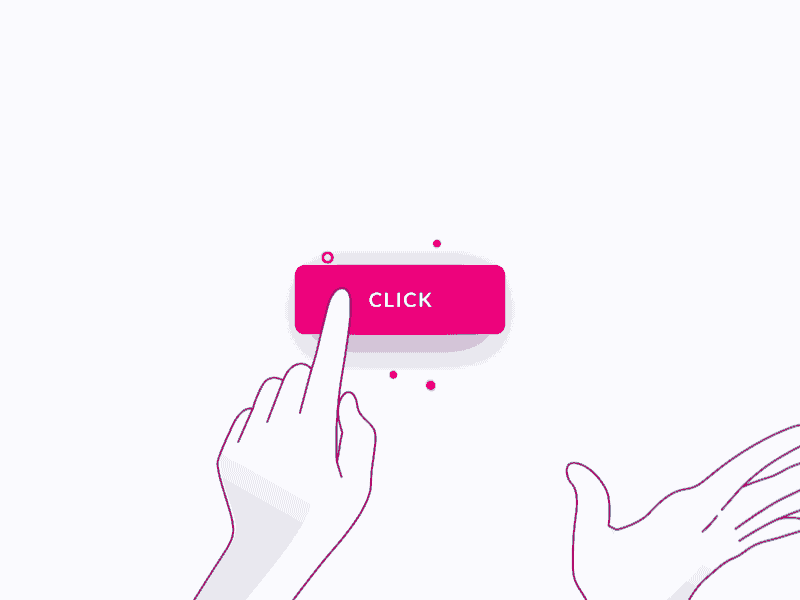
The most frequent form of a button found in UIs is the “standard” button. In most cases, they have a rectangular shape and bear written descriptions. In 2023, these are the best practices for designing conventional buttons:
- Make sure the label on the button can be easily read.
- Make sure buttons stand out with good color and contrast.
- Use a uniform button design to keep the interface looking and feeling consistent.
- If you want your buttons to look their best across all devices, responsive design is the way to go.
2-Ghost Buttons

The ghost button, with its simple elegance, has become increasingly popular in recent years. They have an outline and a see-through background, or “hover” effect. Keep the following best practices in mind when creating ghost buttons in 2023:
- For less important functions, hide the “ghost” button to minimize confusion.
- Add a hover effect to subtly show that something can be clicked on.
- Keep the button outline a contrasting color from the background for optimal readability.
- The addition of micro-interactions might enhance the button’s visual feedback.
3-Raised Button

Buttons that are “contained” or “raised” are typically rectangular and “float” off the screen with the help of a drop shadow. When the button casts this shadow, it can be pressed. These buttons typically offer functionality in large, busy, or overcrowded spaces, and they lend dimension to usually flat layouts.
- Make sure there’s enough of a difference between the elevated button and the background for it to be seen.
- To give the impression that the button is raised, use shadows or gradients.
- Don’t change the style of the raised buttons across the UI.
- Give some sort of visual indication of when the button has been pressed, like a slight shift in color or shadow.
- Make sure the button is large enough and has the right shape to be clicked easily.
Suggested Read: Benefits of using white spaces in UI design
4-Floating Action Buttons (FABs)
Floating action buttons are typically used for primary actions and take the form of circular buttons that float above the UI. Icons are frequently used in place of labels. In 2023, the following best practices should be taken into account when designing FABs:
Use a different color or a different form for the FAB to make it stand out from the rest of the buttons.
- Make use of easily understood icons that depict the required behavior instinctively.
- Put the FAB where it’s easy to get to so that more people will use it.
- Make use of animations or understated motion effects to attract attention to the FAB.
5-Toggle Buttons

Toggle buttons let people quickly and easily toggle between two options, typically on and off or active and inactive. They look different depending on their status, and that status is communicated visually. Toggle button designs in 2023 could follow these guidelines.
- Use visible signals, such as color changes or icons, to clearly identify the active and inactive phases.
- Give the user prompt visual feedback whenever the toggle button is used.
- It’s important that the button’s condition is clear and doesn’t cause any confusion.
- Toggle buttons should look and function similarly across platforms, so it’s important to adhere to design rules for each.
6-Micro interactions and Feedback

Microinteractions and feedback, regardless of button type, are essential for improving the user experience as a whole. Some guidelines to follow are as follows:
- When a user clicks or hovers over a button, the interface should respond visually with a slight animation or transition.
- Clearly communicate the button’s present status (active, disabled, loading, etc.) by using a variety of states.
- Provide unambiguous focus states for buttons and other accessible design standards for persons with disabilities.
- To guarantee uniform behavior, you should check how buttons respond on a wide range of devices and screen sizes.
Suggested Read: How to create a responsive web design for e-commerce platform
Conclusion
It will be essential in 2023 that buttons are designed with the user in mind. User experience for your digital product can be greatly improved by your understanding of the various button kinds and your adherence to standard design guidelines. When developing buttons, keep the context, usability, and visual aesthetics in mind, and don’t be afraid to iterate and get user input to hone your designs.


Leave a Comment