Businesses and designers alike are under constant pressure to provide users with frictionless, logical, and enjoyable UX interactions in today’s ever-changing digital landscape. Keeping abreast of the most recent UX design principles that are changing the face of user experience is essential for success in this field.
The year 2023 welcomes a new era of user experience design principles that will dramatically alter the way we build interactive web content. In this article, we’ll take a look at the top 10 UX design principles that will shape the user experience landscape in 2023, allowing businesses to better engage with their customers.
What are UX design principles?
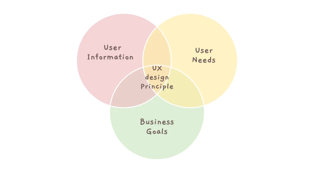
The concepts of user experience (UX) design are a set of standards and best practices for developing products with the end user in mind. UX designers can utilize these guidelines to make sure that their designs are useful, pleasant, and up to user standards.
In a nutshell, the principles of user experience design lay the groundwork for developing solid solutions in line with emerging design patterns, interactive models, and expanding standards.
Read more: Interactive UX Design button practices in 2023
Top UX design principles
To show the skill of UX designers and the scope of the UX industry, we present this list of best practices in UX design. Let’s keep reading to find out more!
1-User-centric Design

The ability to put our feelings in the shoes of the product’s target audience is a crucial design principle. Designers have high standards and always aim to create the finest product possible, which might lead to decisions based on personal preference. However, user preferences should be taken into account when designing a strong UX, so put your own tastes and thoughts aside.
Users are at the center of your design. Their needs, wants, opinions, preferences, and requirements are, thus, essential. That’s why you must put in the time and effort to get to know your users.
2-Consistency

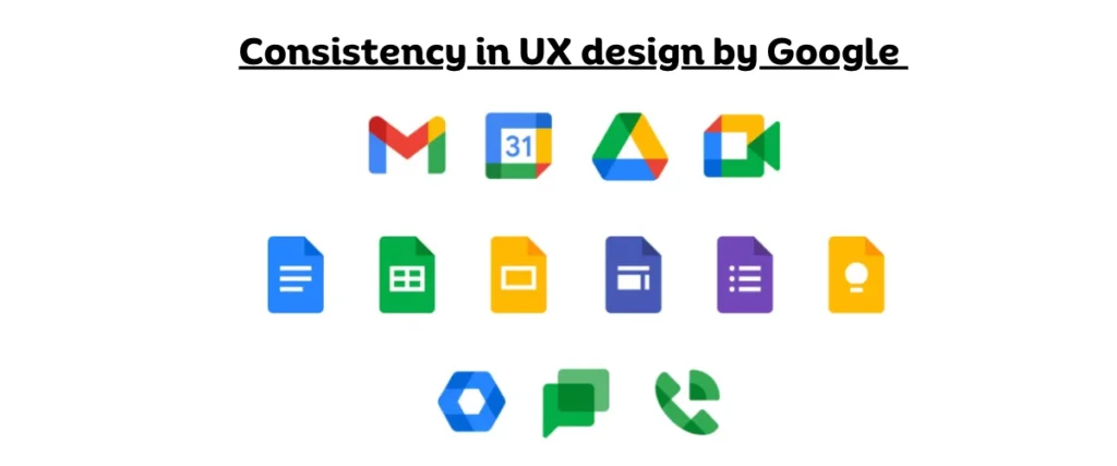
Users prefer new versions of products to be similar to the ones they’ve already used. Users will have an easier time learning how to utilize your product if it has a familiar feel to it. Therefore, designers don’t have to start from scratch on every component.
Designers typically adopt design languages in order to ensure cohesion. A design language is a collection of rules for developing software or hardware in a predetermined way. For example, if you’re building iOS apps, you must follow Apple’s Human Interface Guidelines. If you’re making an Android app, you should check out Android’s Guidelines and Google’s Material Design Guidelines.
3-Accessibility
One of the most important principles of user experience design is to prioritize accessibility. The designer must make sure that many individuals can use the system. It also suggests that users may make use of the poor UX design. It is the designer’s responsibility to remove any obstacles that arise.

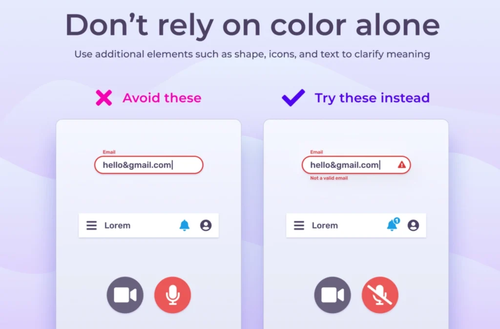
Use color and other design elements like text, iconography, and shape to make your work more understandable and approachable.
This is helpful for those who rely on a grayscale display to concentrate, such as those who are colorblind, have impaired eyesight, or have a cognitive or learning problem. People who use a screen reader will also benefit from clearly labeled text or icons.
Suggested Read: Benefits of using white space in UI design
4-Hierarchy
Another important element of UX design principles is the use of hierarchy. There are many advantages to implementing this approach throughout the planning phase. It makes it simpler for users to navigate your app or website and find what they’re looking for. In addition, it’s vital since it shows you, the creator, exactly how your app or website operates.

It can make your job as a designer easier. Developing a data hierarchy is the first step in applying the hierarchy design pattern. Create a sitemap with its help. In addition, the site map can be used to develop a structural hierarchy for your site’s pages, allowing for more effective and uniform internal linking.
5-Use Control
There are many sorts of user control in UX design principles, but in general, users enjoy a high level of freedom and satisfaction while interacting with your product. Giving users the option to fix their mistakes is an integral aspect of giving them power.

The user must be able to cancel a task he has started, such as creating an event or sending an email. They can be stored for later use in case an unwanted action is performed.
One approach to empowering users is to show advanced users how to become even more proficient. Shortcut keys on the keyboard can assist with this. In addition, macros and templates can speed up the completion of common tasks. Users can also benefit from better searches and a single set of products and features, so they can more easily switch content.
6-Usability
Designers take care of the usefulness of their designs for a variety of reasons. Improving usability is the most valuable service you can provide to your customers. It’s important to ensure that your product works as intended, that your users are comfortable using it, and that it fulfills their needs. If your product is not user-friendly, it may not be useful to those who purchase it.

The fact that usability can’t deal with black and white is the biggest obstacle for newcomers. When it comes to usability, different design teams have varying standards. Beginners understand the importance and versatility of usability in their work, which is why this UX design rule is so important.
Some groups commit to higher usability guidelines, which can be challenging to implement. This ease also allows design teams to set a low standard, which might lead to confused users or the need for a disclaimer.
7-Animation
Adding animations is a great way to keep your users happy. They make your site more dynamic and provide visitors with a more genuine experience. If done right, animations can help the intended audience understand how a website works.

What’s more, it’s possible that the intended audience will remember even the smallest details. Therefore, it would be beneficial if you did not skip the animation, as the power of childlike wonder is limitless.
8-Confirmation

The primary goal of any designer should be error prevention. The user experience suffers when the user mistakenly deletes a product or makes a payment. One of the best ways to prevent these kinds of mistakes is to get confirmation before proceeding with an important or irreversible action.
By requiring confirmation before proceeding, users are given the opportunity to back out of a transaction and reconsider their options. If you’re making an online purchase, for example, you may double-check all of the facts in an instant by using a confirmation screen.
Suggested Read: How to create responsive web designs for e-commerce platform
Final Thought
User experience design (UX) is a fun, fast, and strategic role that may be inspiring. There are a lot of crossovers between UX design for web and mobile and UX design for environments. Paying attention to potential users, defining and meeting business goals, using the latest technologies, planning data design, using different design methods, making sure consistency, and putting users’ needs first will ensure a consistent user experience.
Update your design methods and collaborate with a UI/UX design company that is familiar with the shifting needs of the market if you want to grow your business using cutting-edge technologies. If you want good results, make sure you pick the greatest one.


Leave a Comment